Behind an Icon
We usually see the final product. We judge it pretty quickly. We almost never think how the designer got to that result. Here’s the story behind the icon of Podrover.
I wanted to design it myself, but the entrepreneur side of me won that argument with a “let’s outsource the design of the icon while you keep on building the app”.
I had a few ideas in mind, mostly playing with the concept of rover as a vehicle.
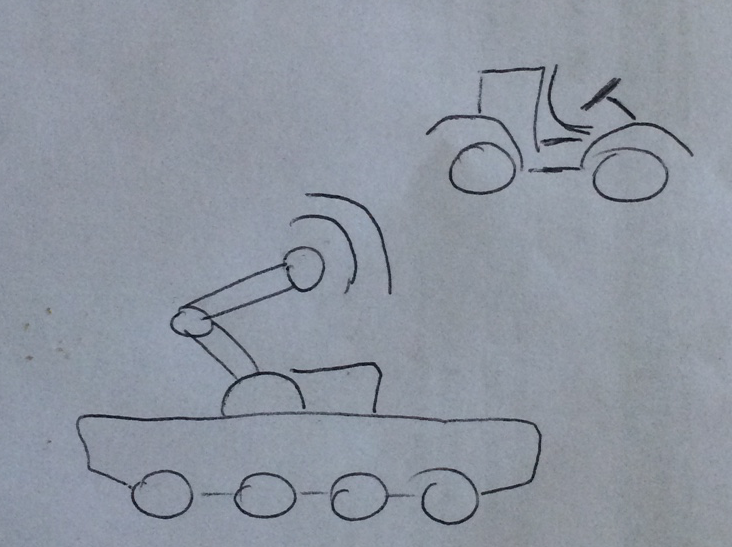
I started working on that in Sketch. I had it ready. I tested it at a small scale, as an iPhone app icon. It looked fine. It “worked”, until I showed it to some friends on the Ray Wenderlich team.
Some feedback was pretty clear: “what is that?”. Until I explained it was a rover nobody got it. Not a nice start.
Honestly I didn’t want to spend a lot of time on the design. So I quickly turned to a character-based icon.

I liked it, I still do. It was not a masterpiece, but I checked the “design an icon” task and moved on. For a few days I still had the icon as a recurring thought. It was marked as “done” but I didn’t feel it was really done.
Then Robert Chen sent me this.

That revived all the thoughts I was trying to sedate. The picture of the dog was taken from some website, so I could not reuse it. Plus I didn’t like it a lot. I wanted something more friendly and even more minimal.
I was developing the queueing system for Podrover and I couldn’t dive into design. Switching would have been expensive. I asked Tammy Coron to design it. We agreed on a price, the number of revisions and she started.
It was clear I wanted to exploit the rover as a dog metaphor now. I pushed also the idea of headphones, but I left Tammy some freedom for the first concepts. Some were very interesting.

The first few weren’t my style. Tammy is a developer, a designer and also a cartoonist. That vein was pretty evident, especially in the first drafts :)
At every review I kept saying “simpler” and “more geometric”. And she heard me, as you can see in the progression above. In the meantime I started doing something wrong. I started micromanaging. Along the lines of:
- the headphones should be rounder
- maybe the nose should be smaller
- the ears should be taller
I am pretty sure she hated me for this (if you talk to her she will deny it :) But she kept going. In the meantime we were way over the number of revisions we agreed upon, and I started feeling uncomfortable about this. So after a few more tweaks we agreed on this.

Since the beginning Tammy was pretty clear that she wanted me to be happy with the final result. I told her I was. But I wasn’t. And I am pretty sure she knew. But we had to close that activity. Don’t put two perfectionists on a task, they might never get it done :)
I payed, she sent me the files, I checked again the “design an icon” task.
I went to bed, mildly satisfied. The morning after I walked to my desk, took the pencil and started sketching again. The first thing I drew was.
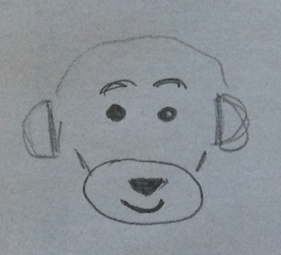
I had it! I opened Sketch and drew it in literally three minutes.
![]()
I am sure that I would have never gotten there without the journey through Tammy’s drafts, without our long conversations, without her trying to extract from me what I was really looking for.
How many times I dismissed an icon because it looked simplistic? Many. “I could draw it in a few minutes” has been my recurring critique for a long time. Now I know there’s much more behind an icon: struggle, changes of mind, difficulty in expressing what you’d really like. Drawing it might be simple. Identifying it is the real task.
P.S. I was happy, I wasn’t really looking for anything more. But a few months ago I got the greatest of the confirmations from a representative of the harshest critics on earth :)
My neice, “Princess Elsa,” loved the @podrover “puppy stickers” I handed out for Halloween. pic.twitter.com/0nPugc9TjW
— Charles Perry (@DazeEnd) October 31, 2015